Julie
Rasos
-
@julierasos.design
Instagram
-
julierasos.com
Website
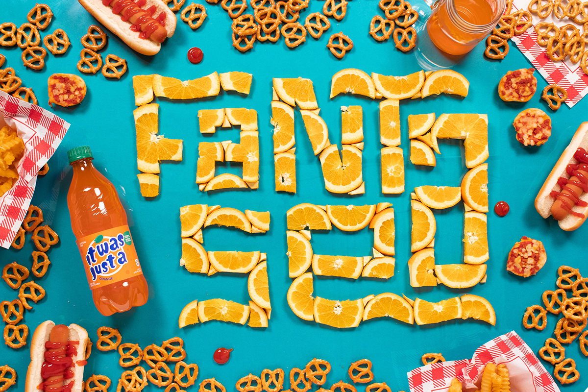
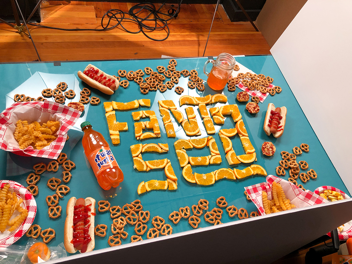
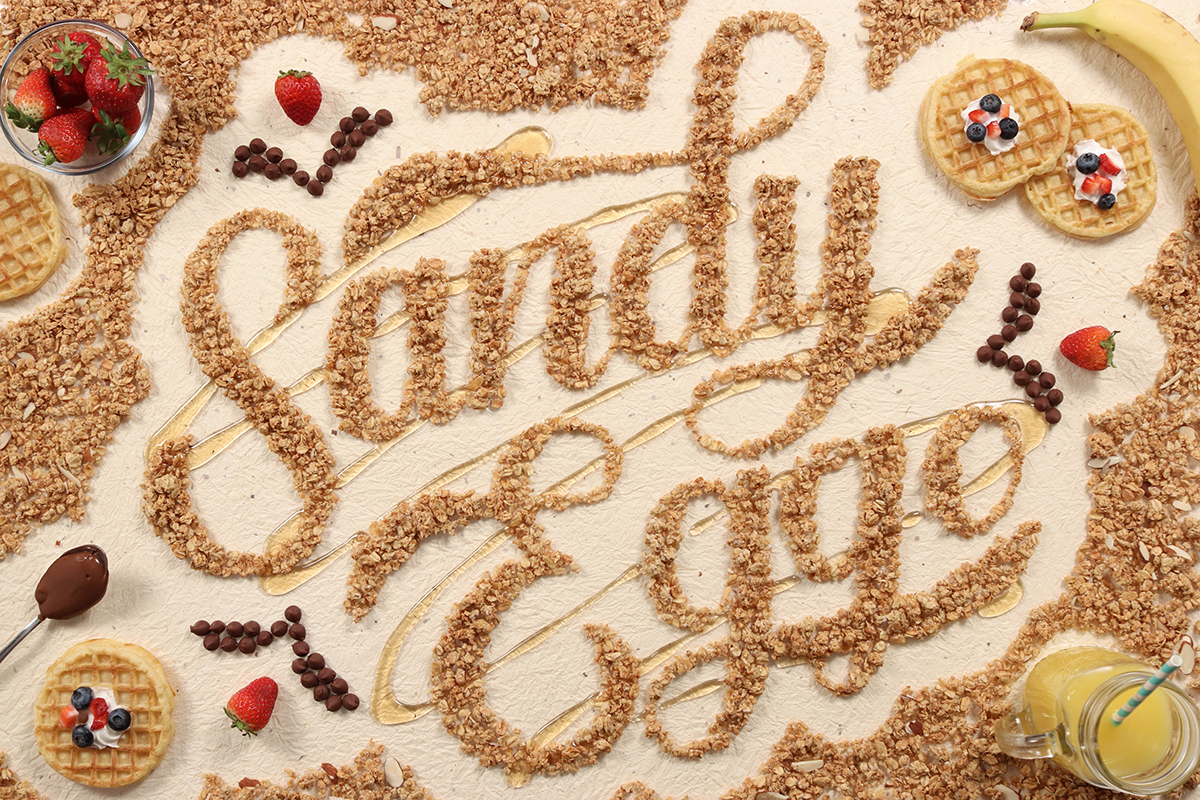
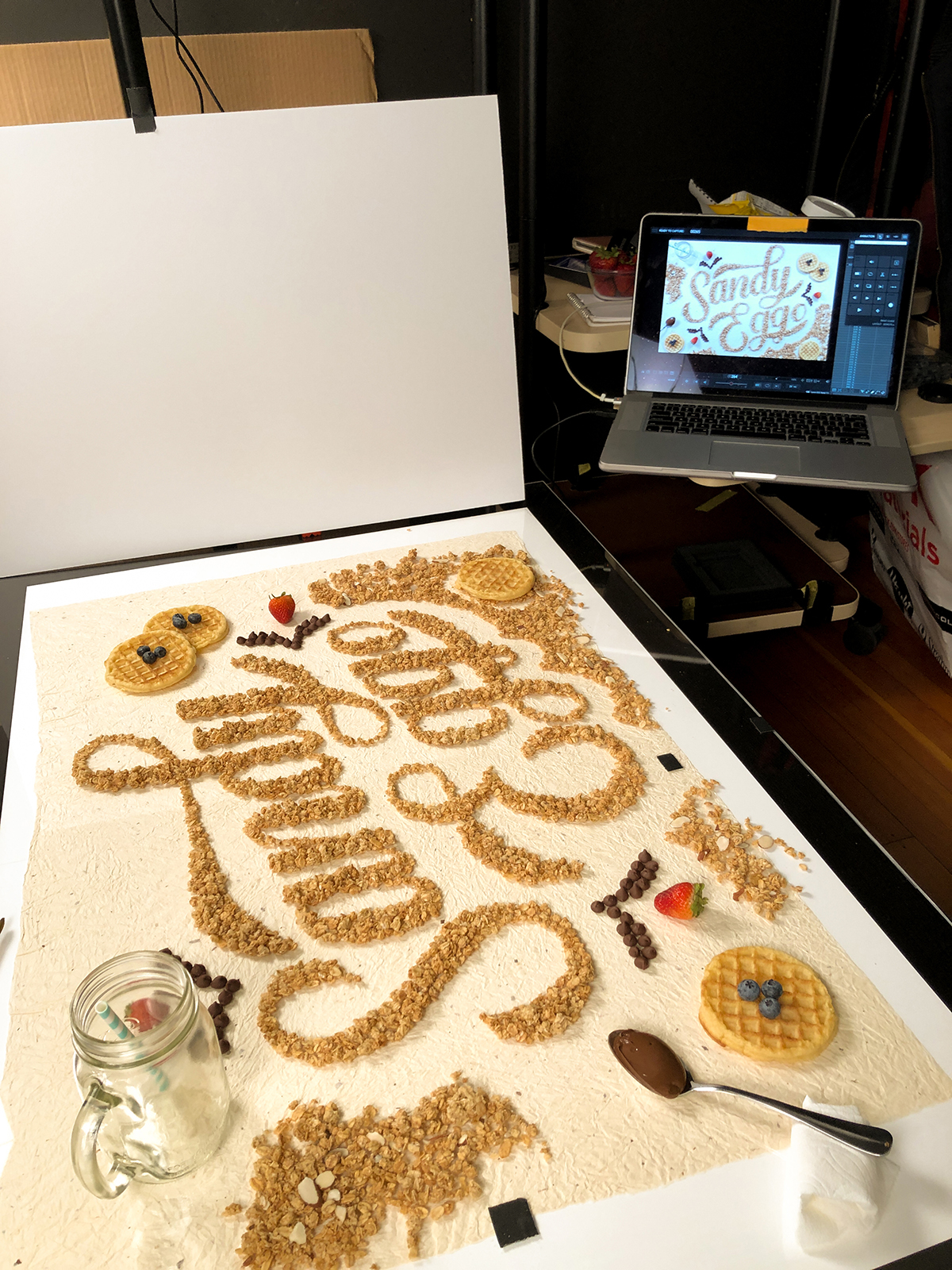
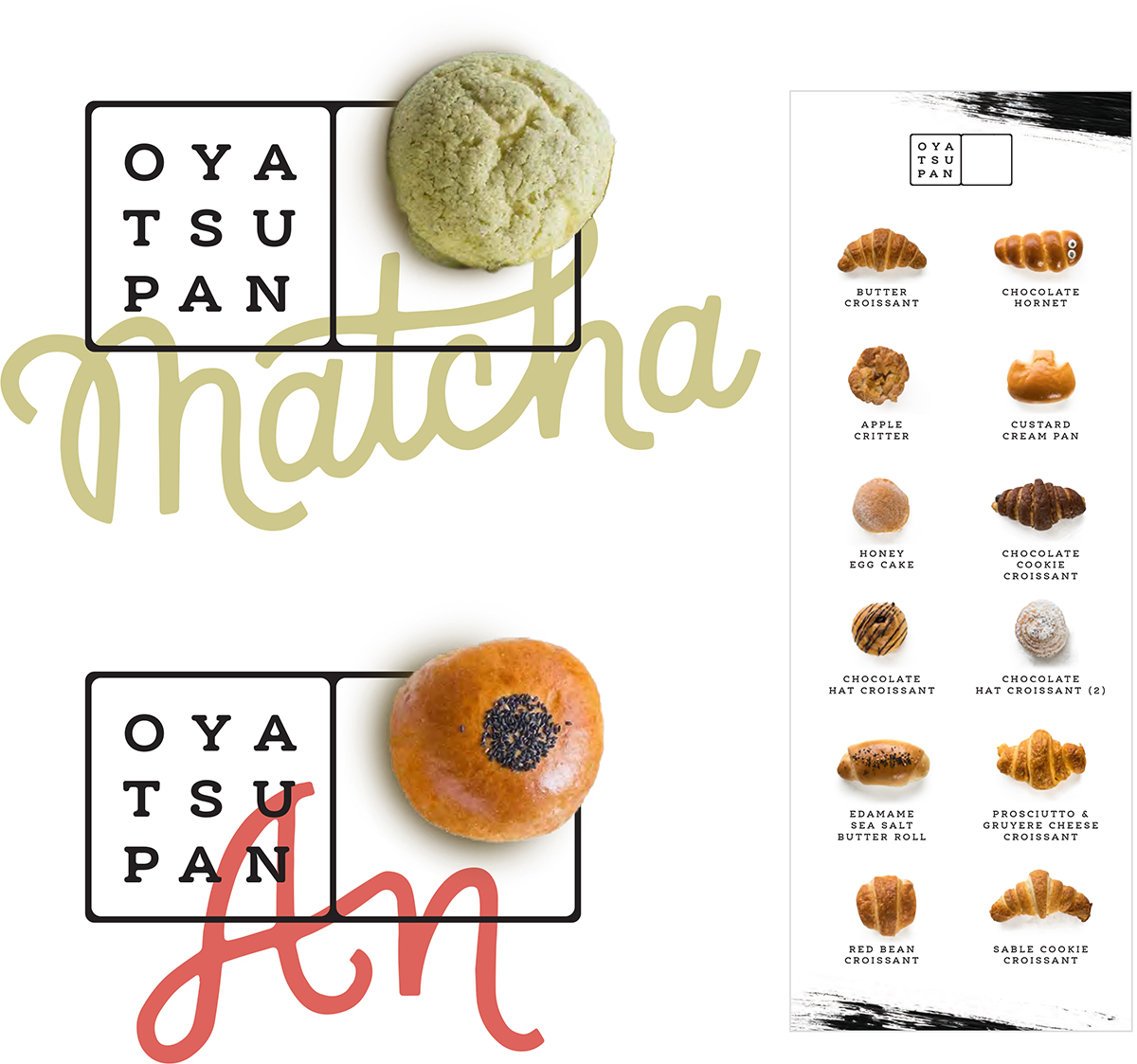
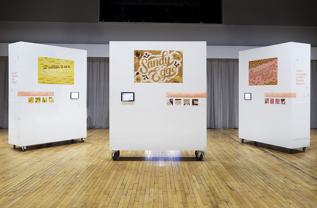
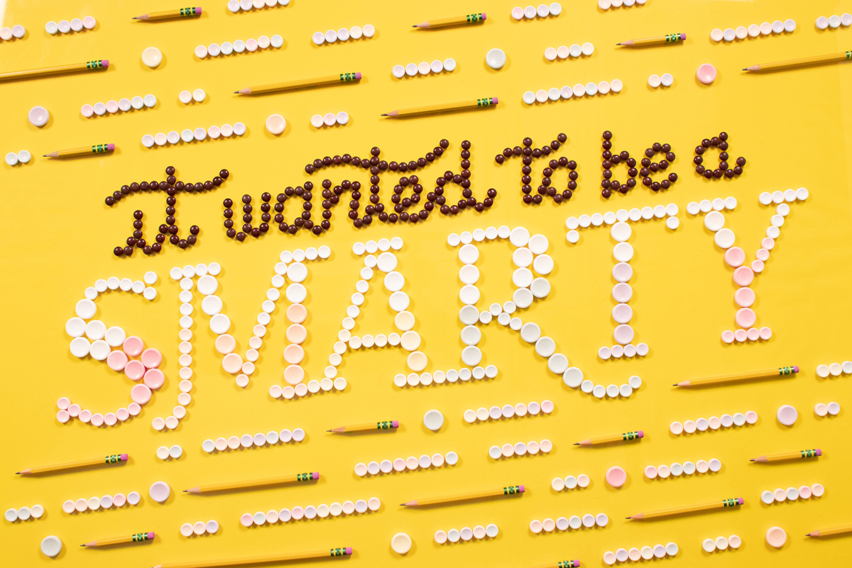
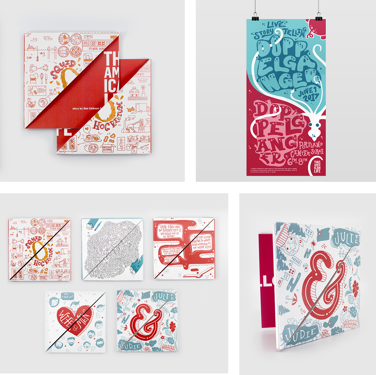
food typography
stop motion animation
digital art
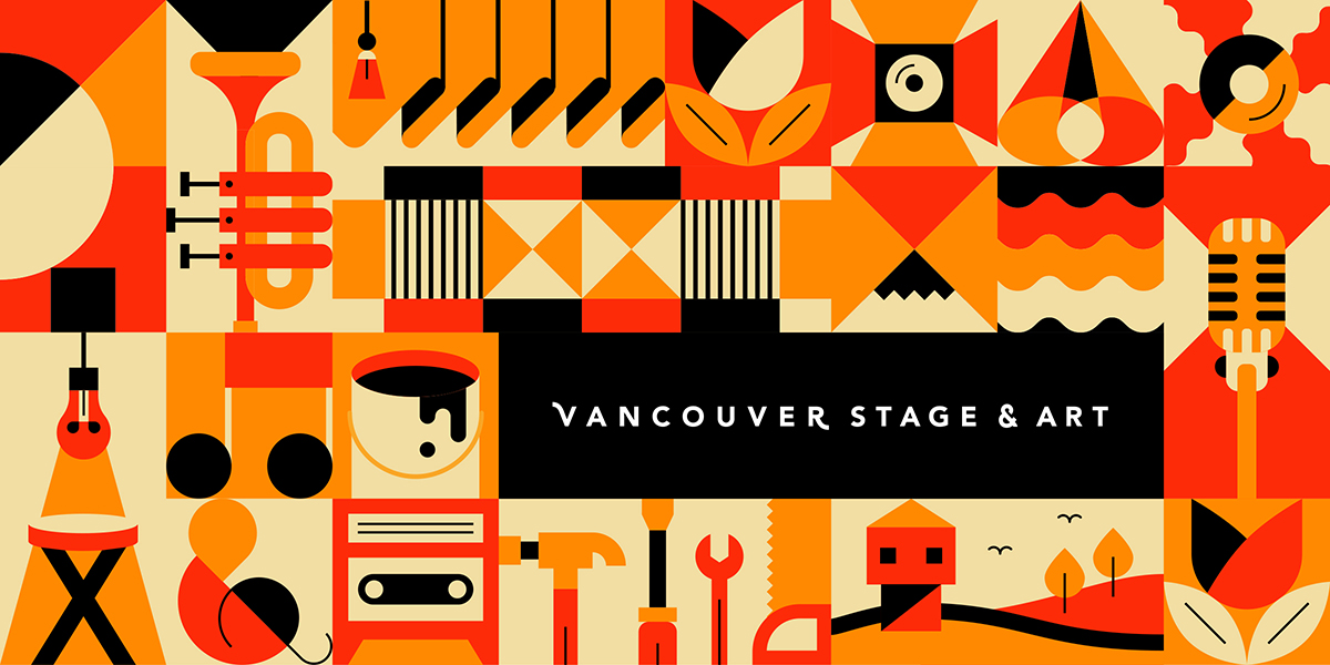
digital illustration
monoline illustration
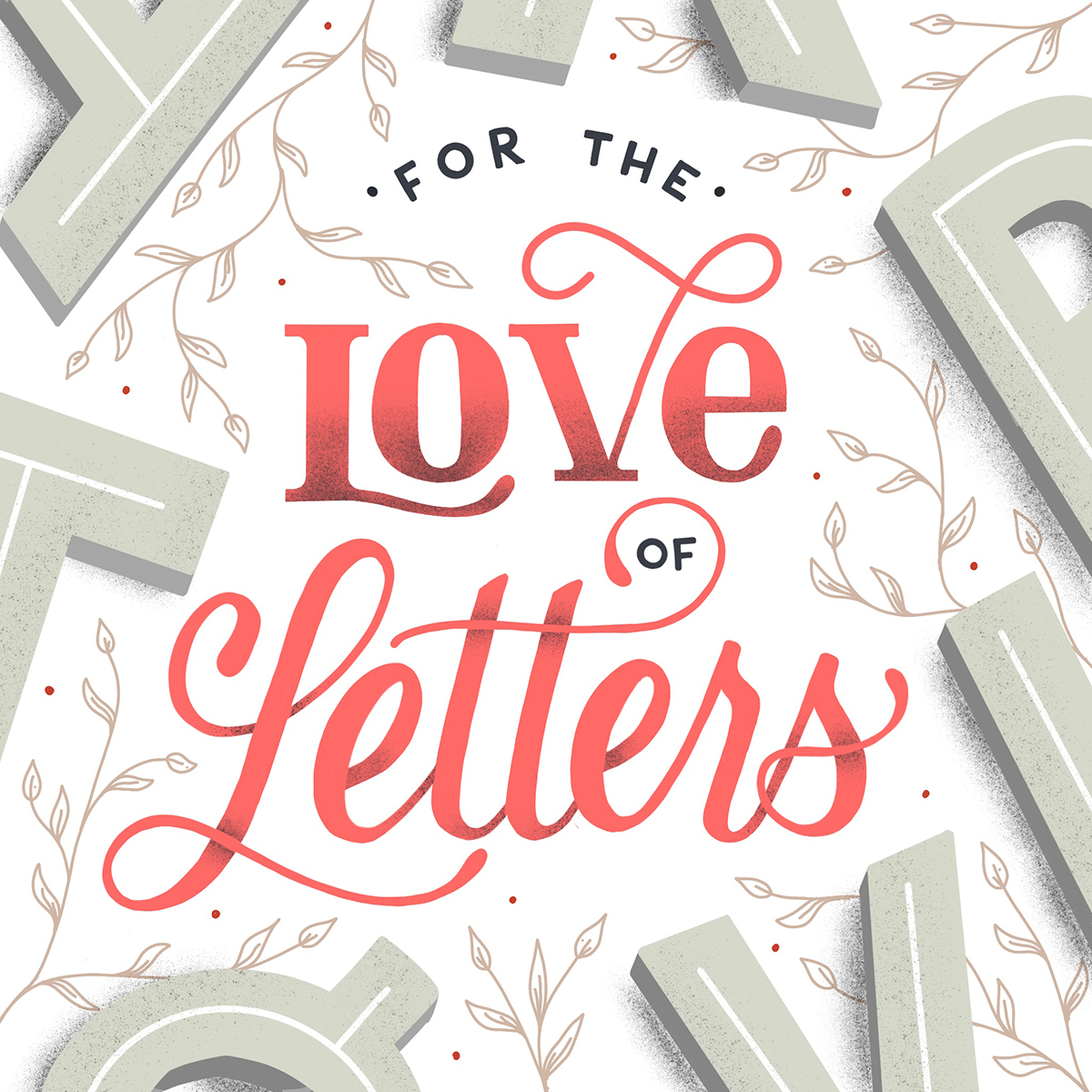
hand-lettering
typography
foodie
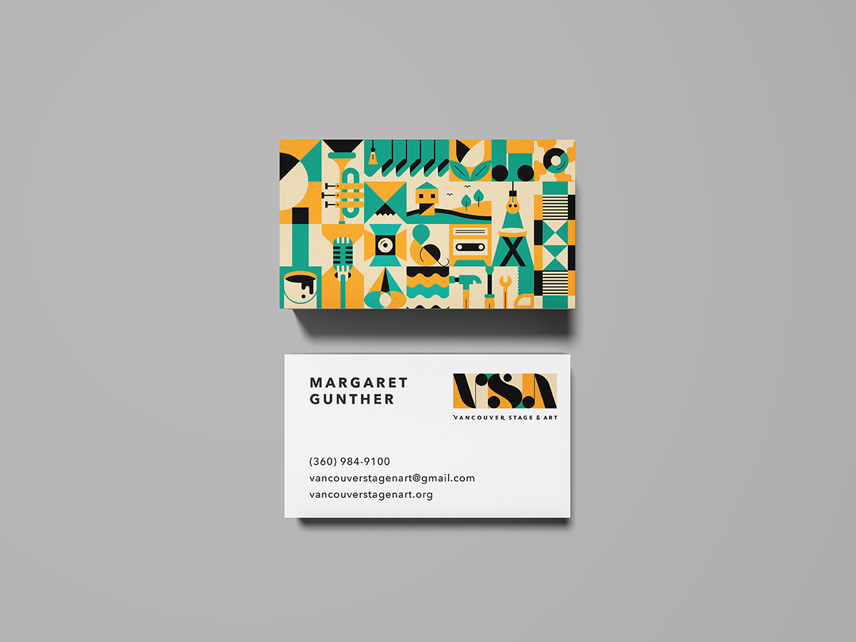
packaging
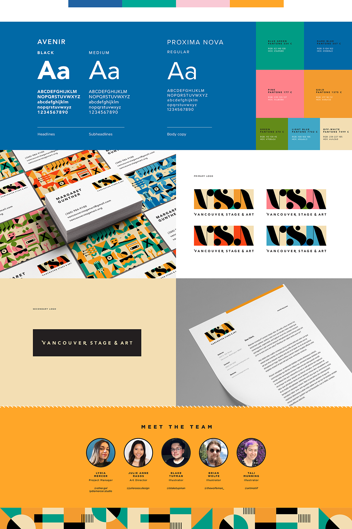
branding
layout
modern
simple
clean
elegant

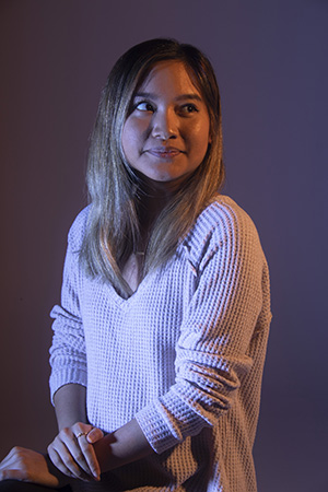
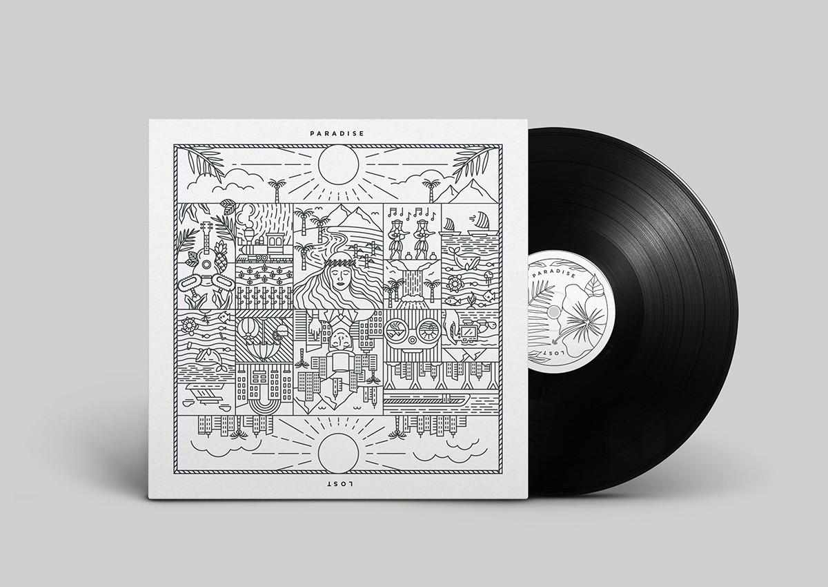
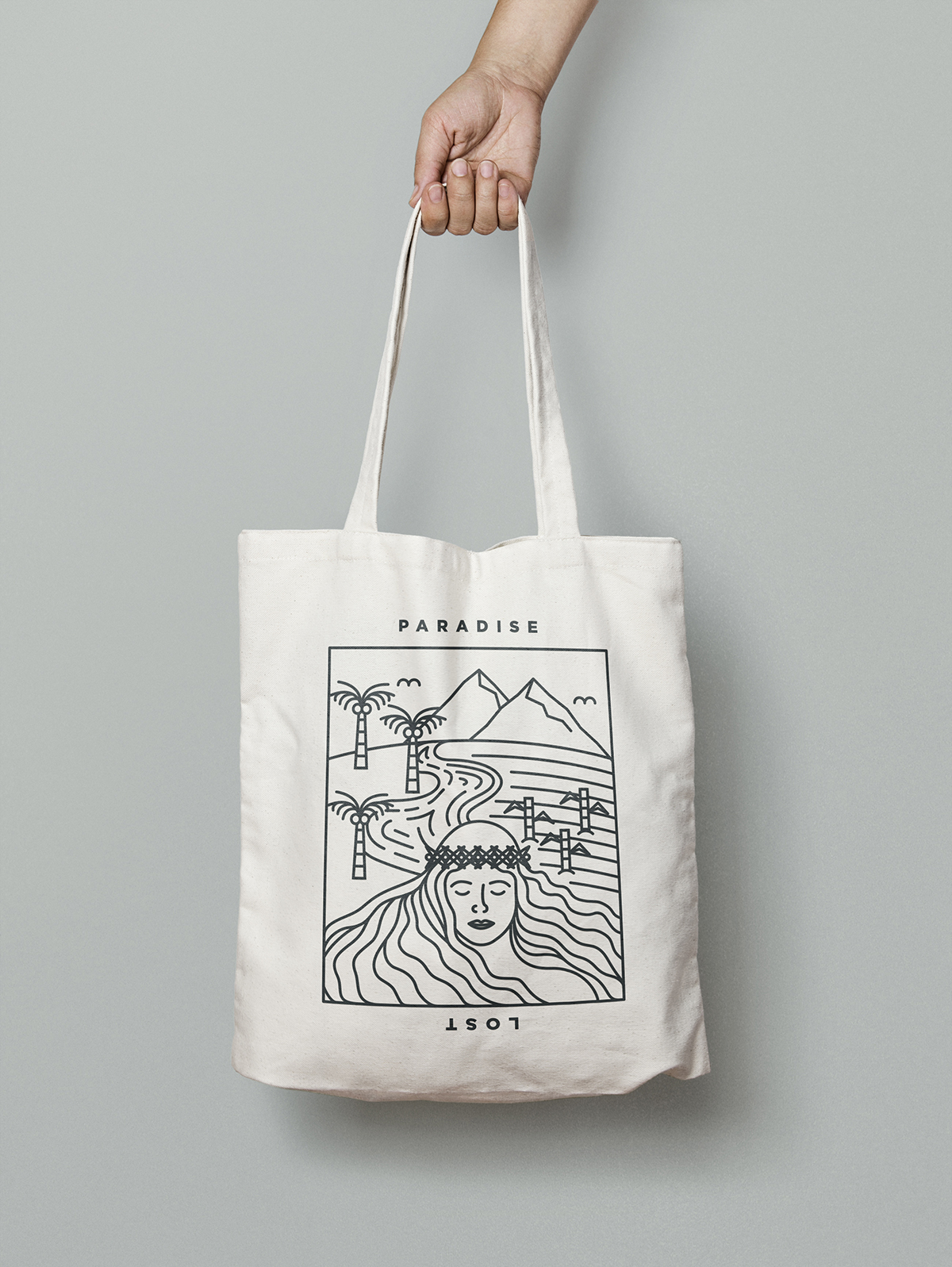
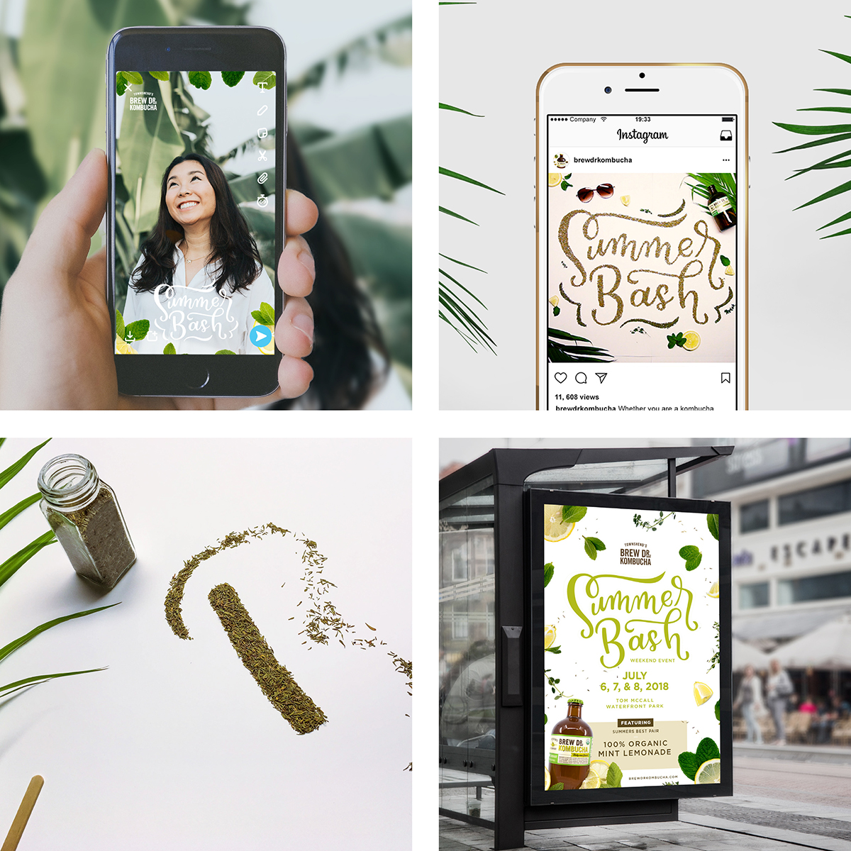
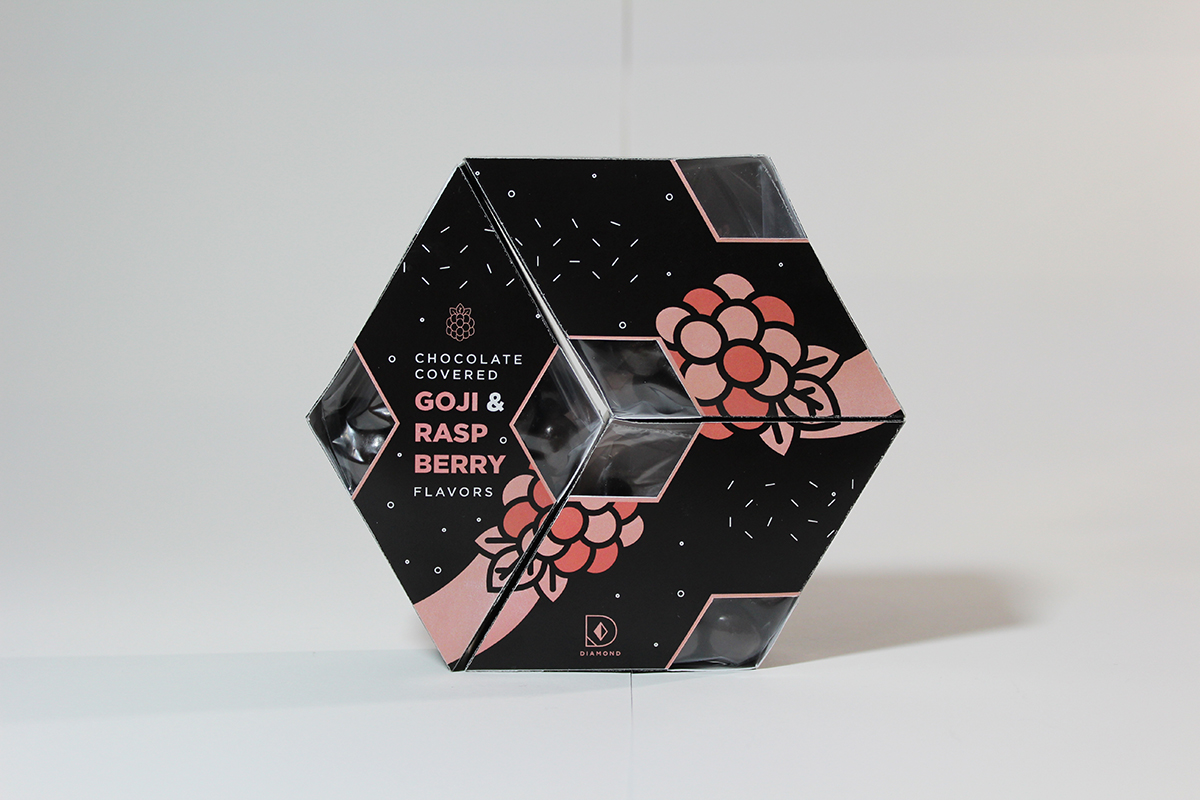
Julie is a graphic designer, illustrator, and lettering enthusiast based out of Portland, Oregon. Her approach to design revolves around combining both hand lettering and digital illustrations to reach innovative and appealing design solutions that tell stories.


Why do you do what you do?
Julie: I don’t talk about this too often, but the reason why I design is because of my older brother. He is a graphic designer and I was inspired by all the work he created in high school. I tried it out for myself, and grew to love it as much as he did. I was basically his shadow, and actually followed him to Oregon and went to the same college he went to. He is now working for the Portland Timbers as a graphic designer and hopefully one day I too get to reach that same goal of working at a great company.
What is one thing you want to learn right now?
Julie: I really want to learn embroidery! I love tedious, hands-on tasks and something about it seems very therapeutic.
No one is perfect and it’s okay to give yourself a break every now and then. There will be times when you feel overwhelmed with things but take deep breaths and tackle it one step at a time.
”What advice would you give your past self?
Julie: Hey girl, don’t be so hard on yourself. No one is perfect and it’s okay to give yourself a break every now and then. There will be times when you feel overwhelmed with things but take deep breaths and tackle it one step at a time.
Sweet or salty? Cake or pie? Coffee/tea?
Julie: Sweet, Cake, and Bubble tea!
What would your alterego do, if not design/illustration?
Julie: When I was little, I wanted to be a massage therapist. I believed that I had “healing powers” and would practice on my parents everyday (haha)! So if I wasn’t a designer, I think I’d be a masseuse or maybe take on some other profession in the health field.

See more:
-
@julierasos.design
Instagram
-
julierasos.com
Website